Troubleshooting
Most problems in a SIEM deployment are the same problem seen from different angles: something that used to arrive has stopped arriving, or something that arrives is not usable. This section gives a method for narrowing that down — work from the outside of the pipeline inward, confirm each layer before blaming the next — and a map of the diagnostic surfaces the product provides. Each page that follows takes one class of problem and works down its layers.
Diagnostic Surfaces
Where the product will tell you something is wrong, if you know to look. Each subsection says what the surface shows, what a healthy reading looks like, and what an unhealthy one implies.
Platform → Applications
Platform → Applications (/platform) carries a status badge on every installed application: Running (green) for a healthy instance and Aborted (red) for one that stopped on an error. A red exclamation mark (!) after the badge marks an application that is still running but has one unhealthy component, matching a red-outlined node in that application's pipeline diagram. Expanding a card draws that pipeline left to right from source to destination, with green outlines and connectors where data is flowing, grey where the path is idle, and red on a node in error.
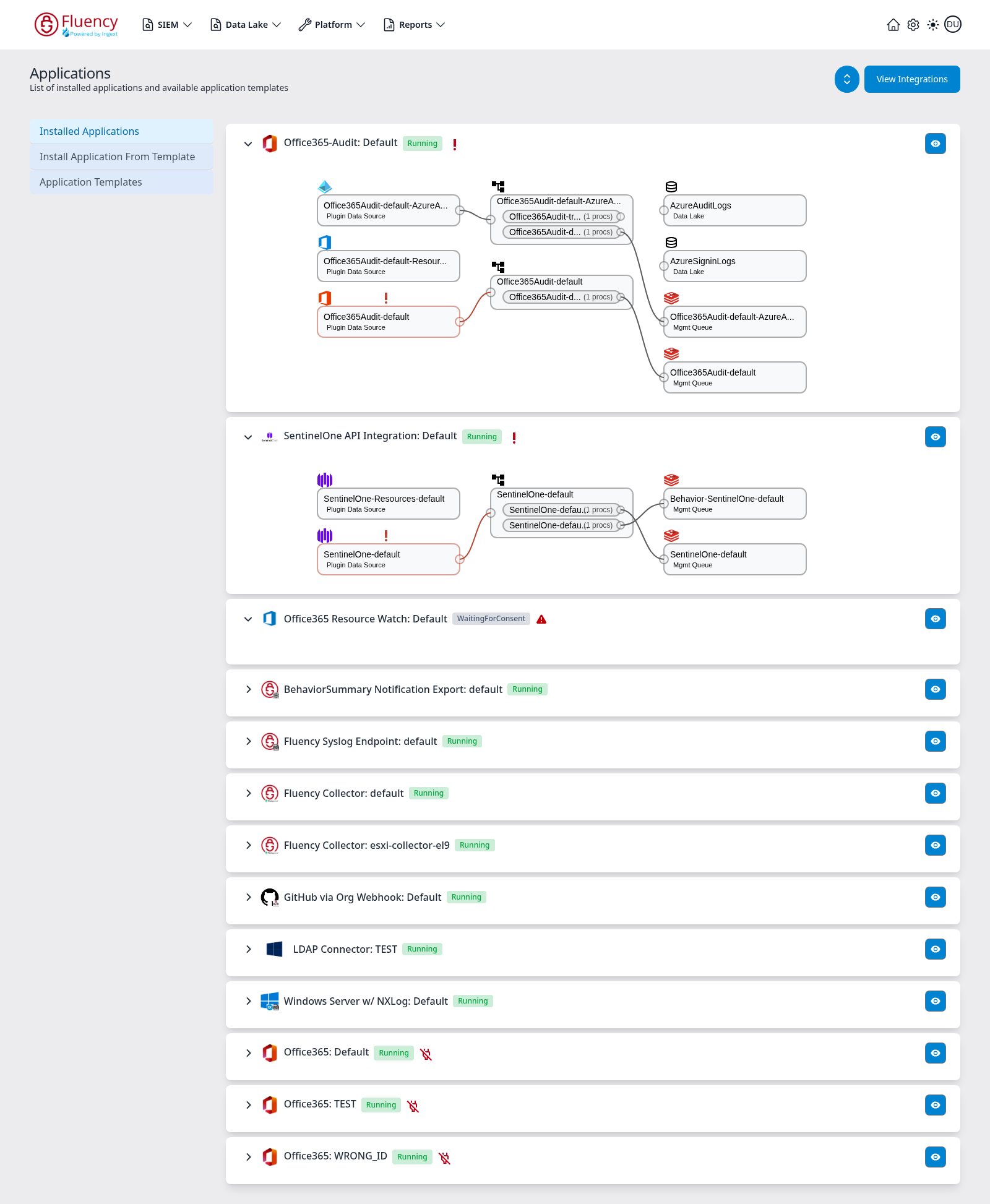
The blue eye button at the right edge of a card opens its details panel. When the status is Aborted, the panel's Details section carries an Error Message in red explaining why it stopped — for example a data-lake index name conflict:
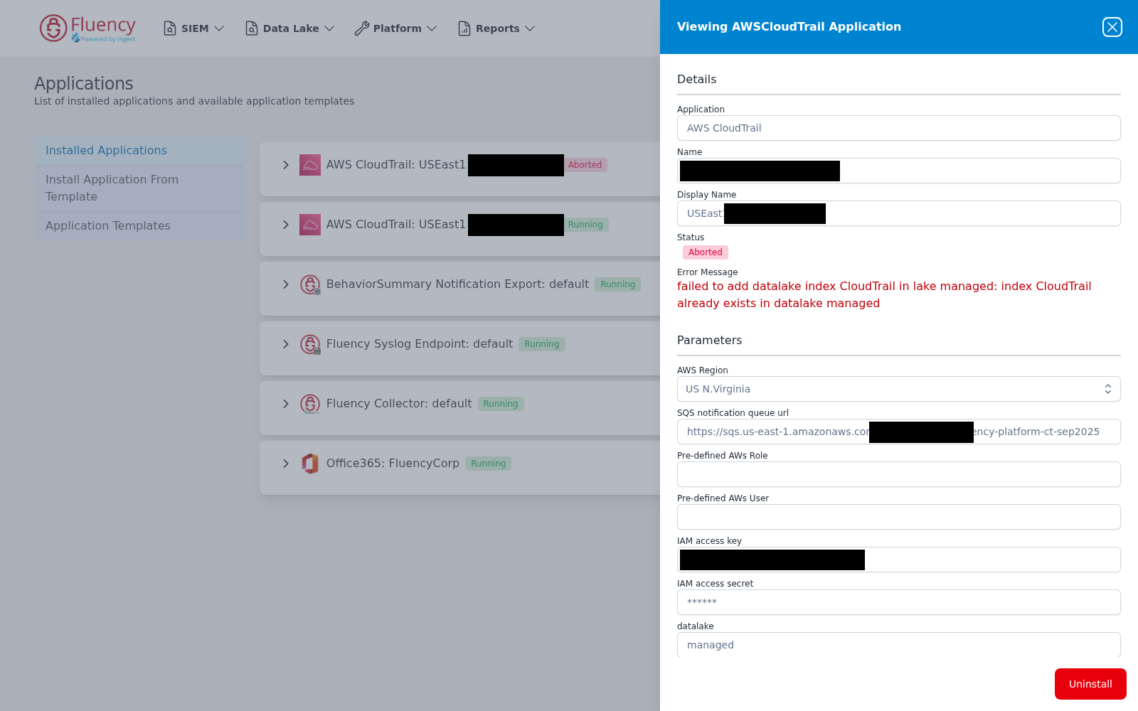
This is the first place to look when one source stops and the others keep going. Control-by-control walkthrough: Installed Applications.
Home Dashboard Application Cards
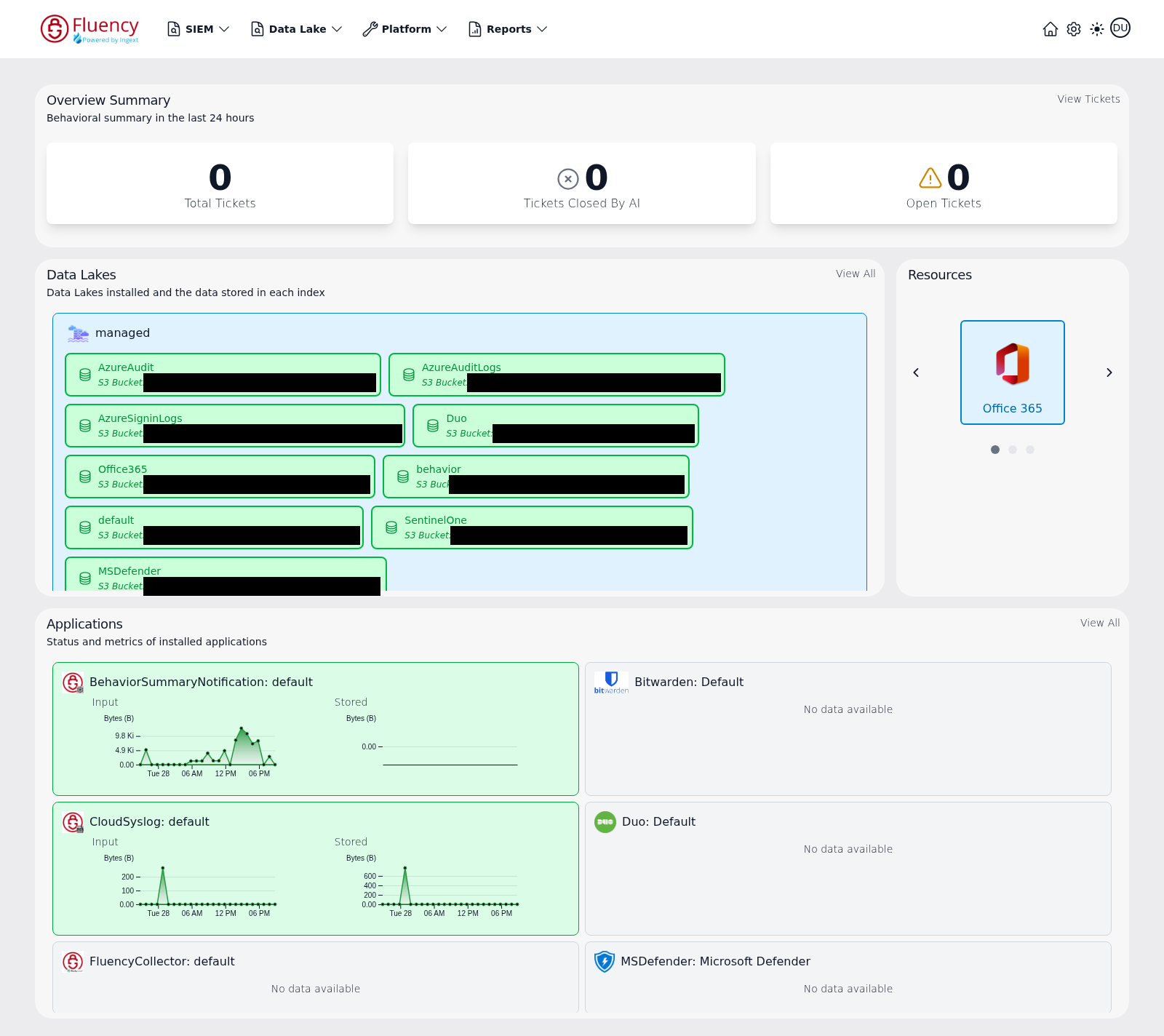
The Home dashboard's Applications panel shows installed applications as status cards, one per application, titled with the application type and the instance it is configured for. Cards that are receiving data are tinted green and carry two small time-series charts, Input and Stored, each plotting Bytes (B) over the recent 24-hour window; a card with no recent data reads No data available instead, on a neutral or red background. A card that is not green, or whose charts have flatlined, localizes the problem to one integration at a glance.
Platform → Usage
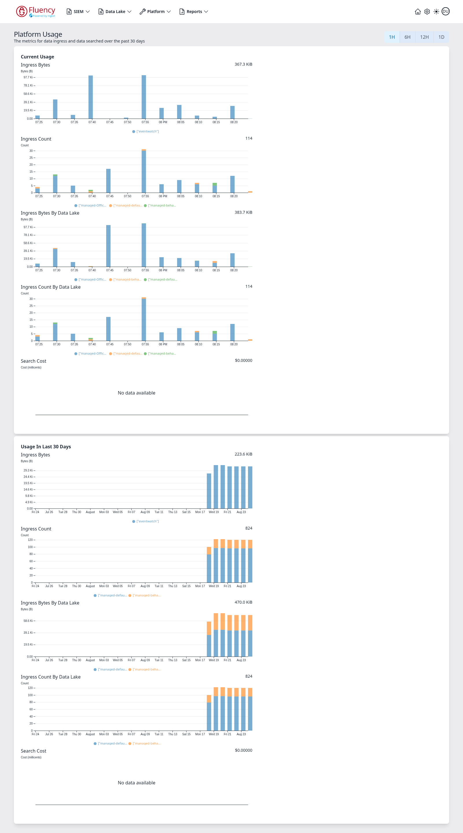
Platform → Usage (/platform/usage) plots ingress and search cost, with 1H, 6H, 12H, and 1D buttons in the upper-right corner setting the window for the Current Usage panel; a second panel, Usage In Last 30 Days, is fixed at thirty days. Each panel holds five charts: Ingress Bytes, Ingress Count, Ingress Bytes By Data Lake, Ingress Count By Data Lake, and Search Cost. Hovering a bar shows the series name, the Time of the interval, and the Value. Use the per-data-lake charts to see which index stopped and exactly when, and Search Cost to see whether a cost problem is coming from queries rather than ingest.
Data Lake → Management
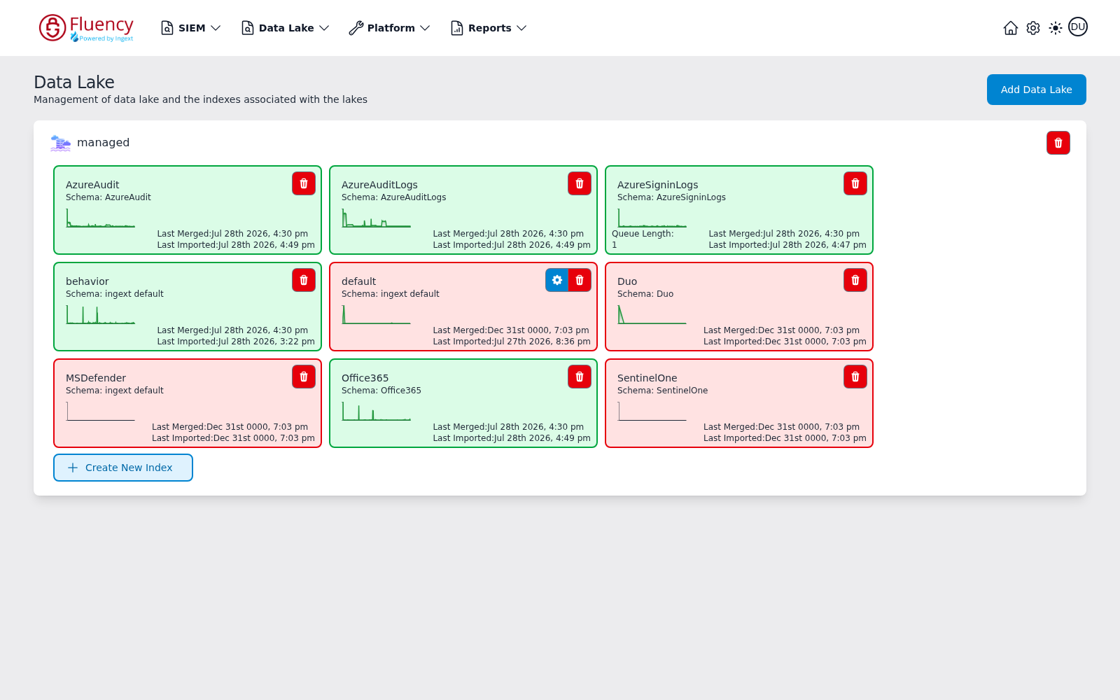
Data Lake → Management (/dataLake/management) shows one panel per data lake, with a status card for every index in it. Each index card gives the index name and the schema it uses, an activity sparkline of recent ingest, Last Merged and Last Imported timestamps, and a Queue Length counter when events are waiting to be imported. Card color tracks merge state, not import state: a card is green once the index has been merged, and red while its Last Merged value is still the zero-date placeholder Dec 31st 0000. A red card can still show a real Last Imported timestamp — data has arrived but has not been merged yet — so read the two timestamps rather than the colour. A queue length that is non-zero and rising means data is arriving but not landing — a very different problem from data not arriving at all.
Settings → Management → Audit
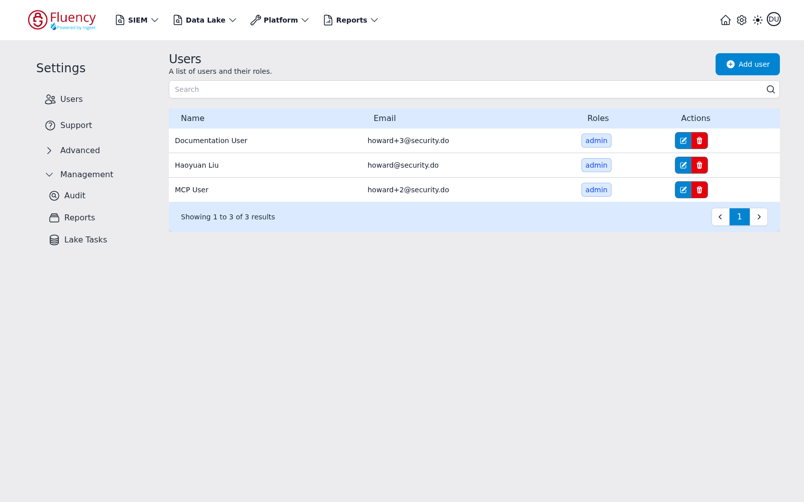
Audit (/settings/audit) sits under the Management group in the Settings sidebar, alongside Reports and Lake Tasks; click Management to expand the group in place. The audit record is what was changed in the platform and by whom — this is how "what changed?" gets an actual answer. Background: What Is an Audit Log.
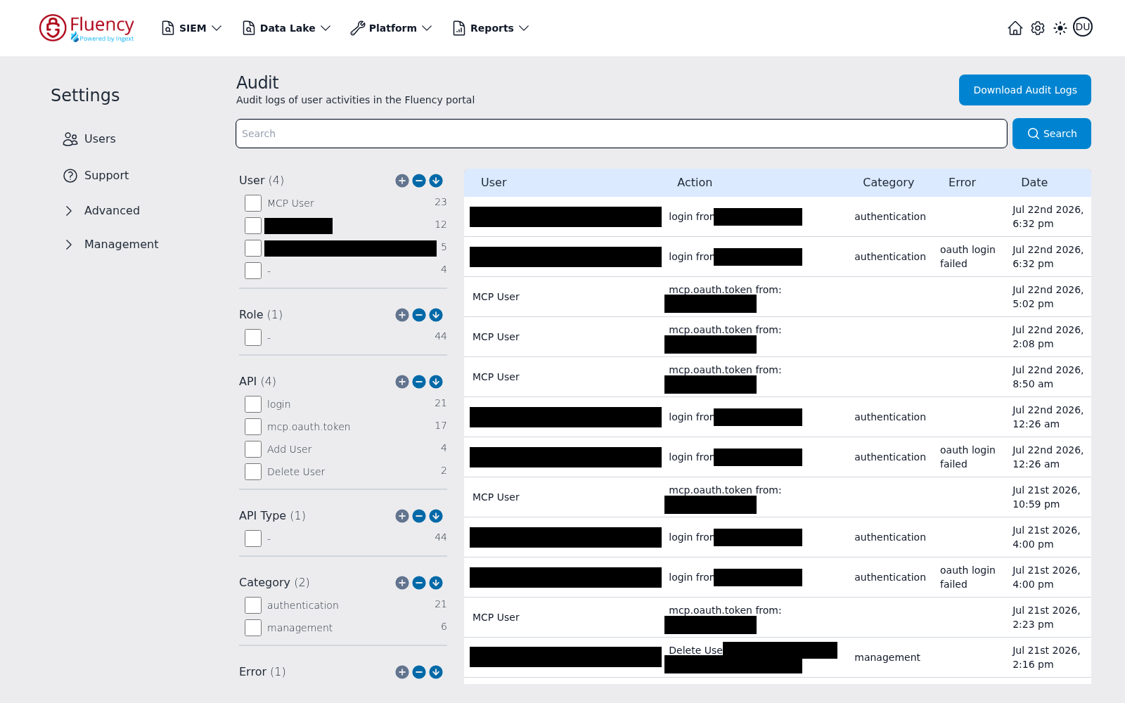
The page is a Search field over a table of User, Action, Category, Error, and Date, with a faceted filter panel on the left grouping User, Role, API, API Type, Category, and Error. Tick a value in the API facet — login, Add User, Delete User, and so on — to answer "who changed this and when" in one click, and combine Category: authentication with the Error facet to isolate failed sign-ins. Download Audit Logs, in the upper-right corner, exports the log for a case or an access review.
Settings → Management → Lake Tasks
The Lake Tasks entry in the same Management group shows the platform's own storage-side work. Use it when data has been accepted but is not yet queryable.
Reports → Scheduler Run History
Aborted scheduled runs, climbing run durations, and rising cost all show up in the Scheduler's prior-runs table. See Scheduling and Delivery.
Data Lake → Investigations
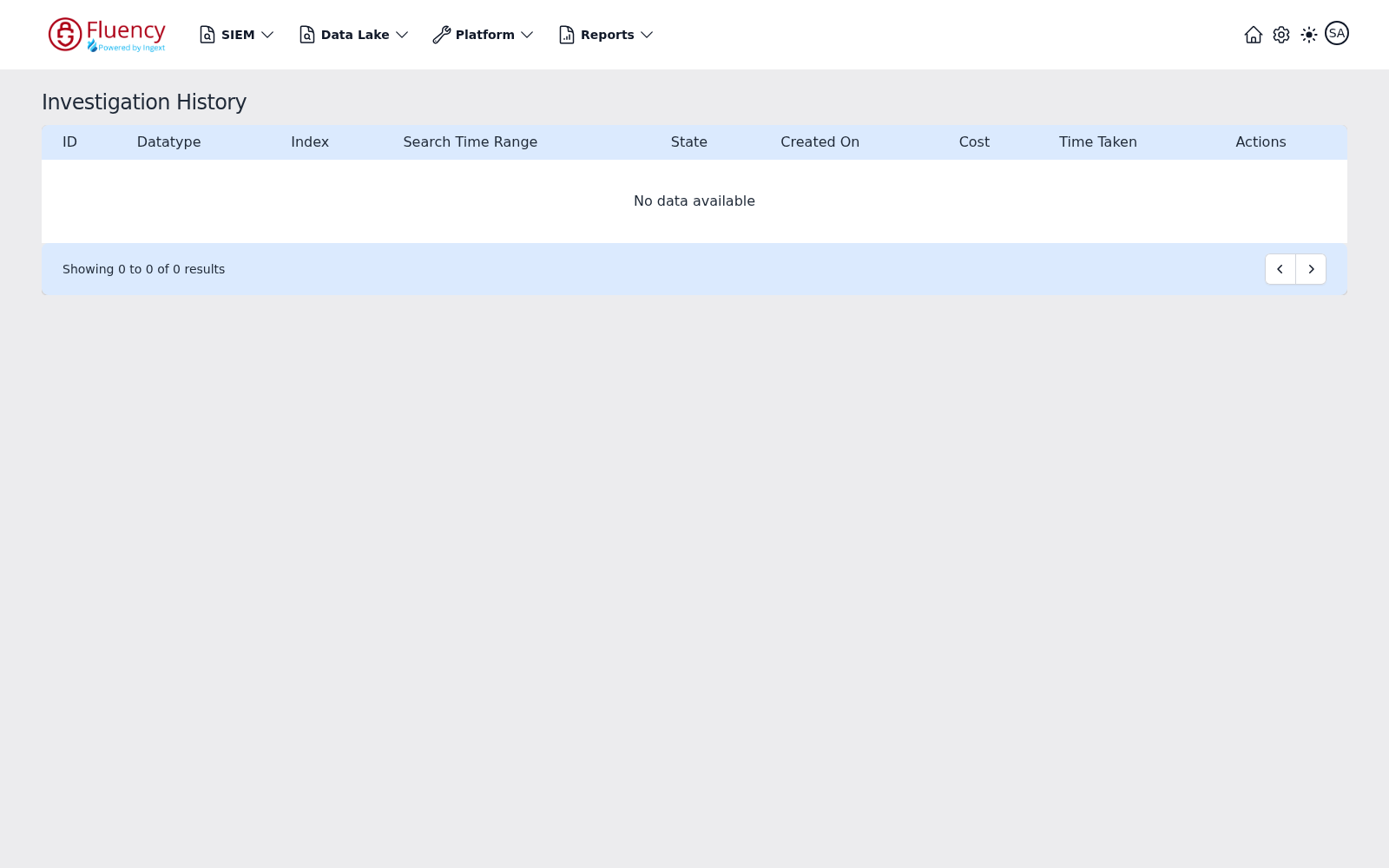
Long-running or expensive searches are tracked on Data Lake → Investigations (/dataLake/search/history), titled Investigation History on screen — one row per run, with ID, Datatype, Index, Search Time Range, State, Created On, Cost, Time Taken, and Actions columns. This is where a "the search never came back" report gets resolved: State gives the run's current state, Cost the cost of the search, and Time Taken how long the run took.
Collector Console
For collector-side problems the diagnostic surface is the collector itself, over its console. See Fluency Collector.
Related
- No Data Arriving — the most common class of problem
- Notification Delivery — alerts and actions not firing
- Search and Performance — empty or expensive searches
- FAQ — historical answers, pending review
- Data Collection — how data is supposed to get in
- Page Functionality — the interface reference