Home
The Home page is the landing dashboard shown after sign-in. It gives an at-a-glance summary of ticket activity, the data lakes and indexes in the account, installed resources, and the health of installed applications.
Menu path: Home (house icon in the navigation bar, also the landing page after sign-in) · URL path: /home
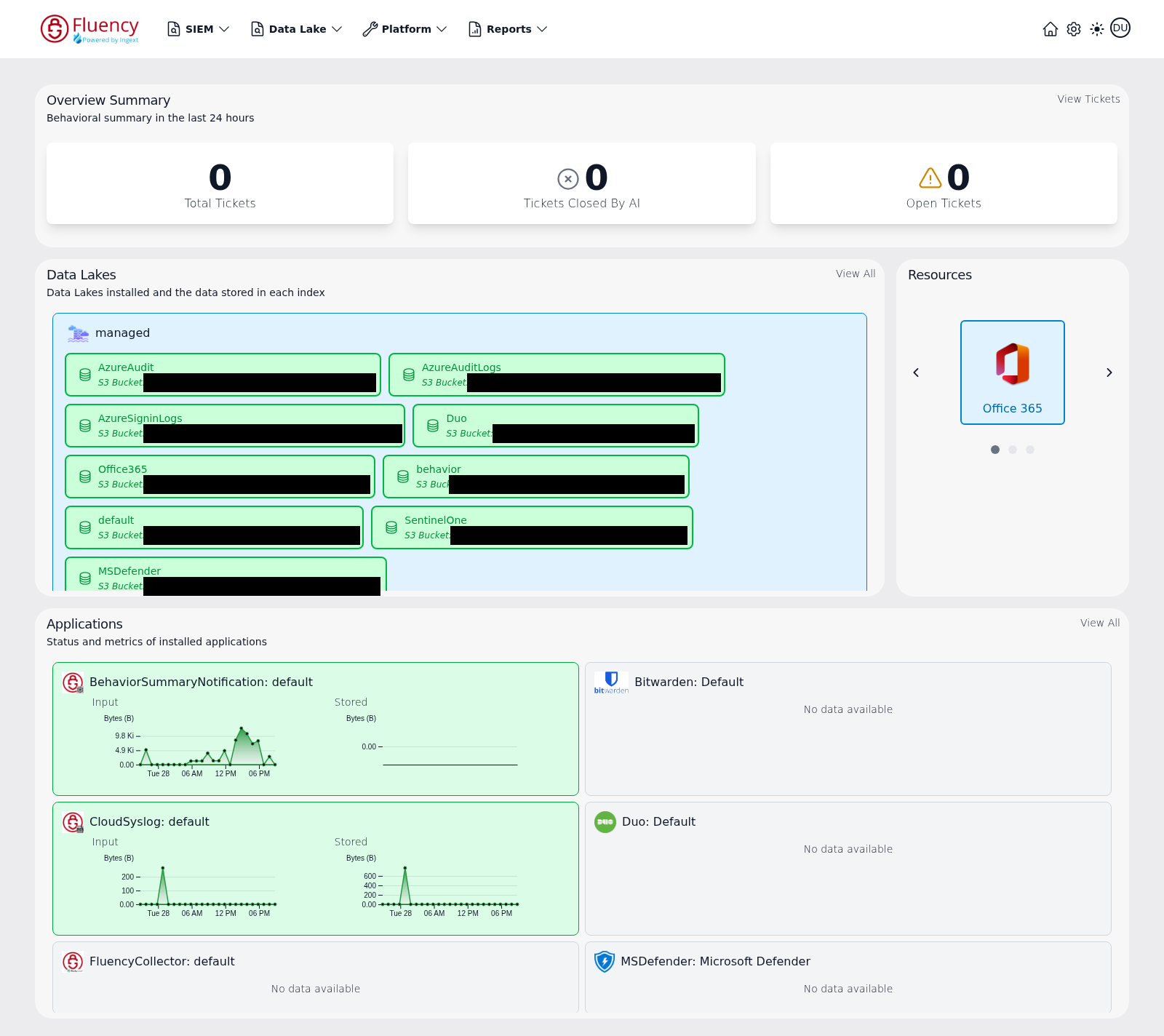
Page Layout
The dashboard is arranged as three stacked panel rows:
- Overview Summary — a full-width panel of ticket counters at the top.
- Data Lakes (left) and Resources (right) — a two-panel row in the middle.
- Applications — a full-width panel at the bottom with a grid of application status cards.
Each panel has a title and, except for Resources, a short description and a link in its upper-right corner that opens the corresponding full page.
Overview Summary
Shows the behavioral summary for the last 24 hours as three counter tiles:
- Total Tickets — the number of tickets generated in the period.
- Tickets Closed By AI — tickets resolved automatically, marked with a circled-x icon.
- Open Tickets — tickets still awaiting review, marked with a warning-triangle icon.
Click View Tickets in the panel's upper-right corner to open the full ticket list.
Data Lakes
Lists the data lakes installed in the account and the data stored in each index. Each data lake appears as a named group (for example, a lake named after its deployment), and inside the group each index is shown as a chip that displays:
- The index name — a
defaultindex plus one per source, such asbehavior,Office365,AzureAudit,AzureSigninLogs,Duo,SentinelOneorMSDefender. - The storage location backing the index — the S3 bucket and object prefix where its data is kept.
When a lake holds more indexes than the panel has room for, the list scrolls inside the panel.
Click View All in the panel's upper-right corner to open the full Data Lakes page.
Resources
Shows the integrations that have contributed resources to the account, one at a time, as a carousel. The current integration fills the panel as a large tile with its icon and name — Office 365 in the capture above.
- The ‹ and › arrows on either side of the tile step through the available integrations.
- The row of dots beneath the tile shows how many there are and which one is displayed.
- Clicking the tile opens that integration's resource list — the Office 365 tile opens
/SIEM/resources/O365/Applications, for example. See Resources for the list view.
Stepping the carousel on changes only the tile; the rest of the dashboard is unaffected:
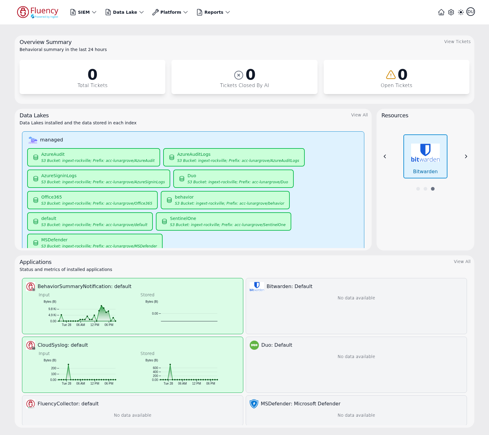
When no resources have been collected, the panel shows No resources installed and has no controls.
Applications
Shows the status and metrics of installed applications as a grid of cards. Each card is titled with the application type and the instance it is configured for — a behavior summary notification export, a cloud syslog receiver, a collector, or a vendor integration such as Bitwarden, Cisco Duo or Microsoft Defender.
- Cards for applications that are receiving data are tinted green and contain two small time-series charts, Input and Stored, each plotting byte volume (Bytes (B)) over the recent 24-hour window.
- Cards with no recent data display No data available instead of charts; such a card may appear on a neutral background or highlighted in red.
Click View All in the panel's upper-right corner to open the full Applications page.